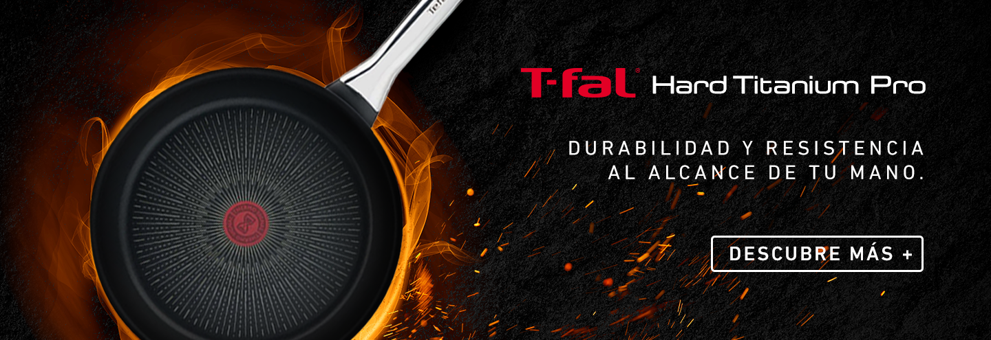
T-FAL
From shaping key visuals to adapting content across different brands, I was involved in both directing the look and building the work itself. It was fast, demanding and incredibly detail-driven—a period that taught me how much good craft can do when time is limited and consistency still matters.

KRUPS
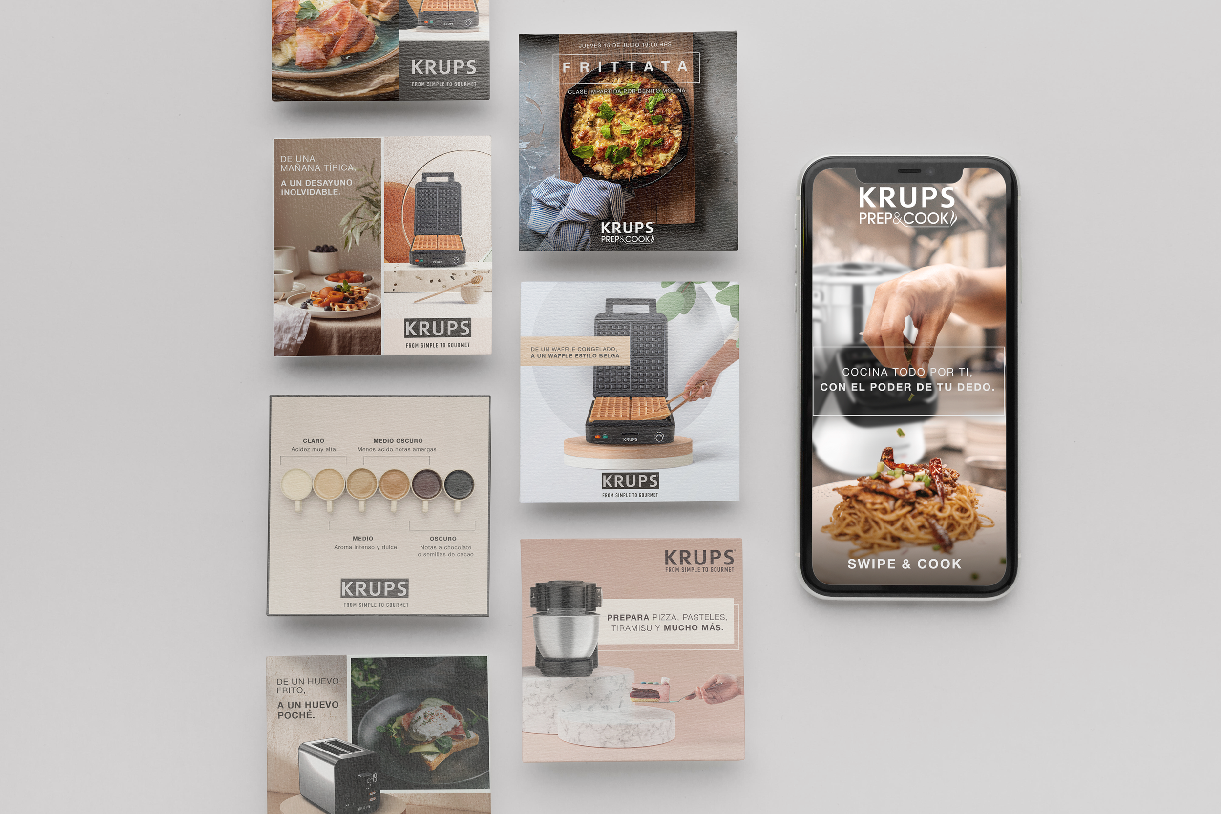
The focus was on making everyday product communication feel a little sharper and more elevated—clean compositions, strong product moments and a visual world that felt polished without becoming too serious.
ROWENTA
Rowenta gave us more room to play with movement, performance and everyday use, turning functional product benefits into visuals that felt fresh, dynamic and easy to connect with.